
Overview
I. Open a TradingView account to use (*free lite-versions available)
II. Choose the “BTC” trading pair that corresponds to your fiat currency
III. Select the time frame to fits your analysis (*4HR+ is standard)
IV. Choose Indicators & Strategies to overlay on the chart
V. Customize the Settings to change the view to your preference
First Steps
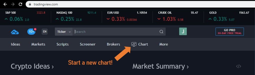
This short post is dedicated to creating the chart that I look at and view almost every day to watch bitcoin. Once you have your TradingView account set up and ready to go, let’s get started in recreating my chart and if you’d like can take it on your own from there. Click on “Chart” on the upper tab of the page to begin working on the layout.

Currency Pairs
Since I’m in the United States, the bitcoin to fiat pair that will be best for me is the United States Dollar or “BTCUSD” that has coverage from Bitfinex, Bitstamp, Bittrex, CEX.IO, Coinbase, Gemini, and more crypto exchanges providing trading data. My go-to for my view is Coinbase since they handle a large portion of the total volume and likely have the majority of American traders and funds on their platform. Once the desired pair is selected, the corresponding chart should open.

Fitting the Screen to Time and Price
Next, I will immediately click on “log” and “auto” in the bottom right hand corner of the chart to put it on a logarithmic scale (because bitcoin has been know to move “super-linearly”) and so it will automatically fit the view for me. From there, you can click on the time frame directly the right of “BTCUSD” ticker box in the upper left hand corner of the chart to pick the time interval of your choice. On my chart, I like to choose the “4HR” interval since it roughly covers just more than a year when the chart is open in full-screen view and completely zoomed out which can be done by hovering the cursor over the chart and scrolling down on the wheel of the mouse.
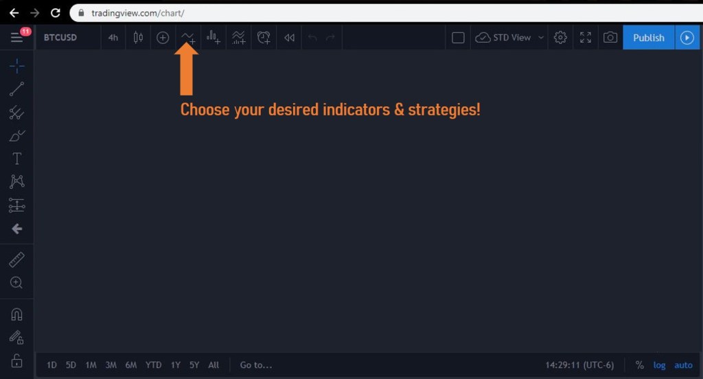
Indicators & Strategies
From this point, it really comes down to personal preferences and as said before the layout is yours to customize as you please and it may be helpful refer to YouTube as a source for how to really make your charts look nice too. My chosen presets are to start with searching the “Lazy Bear” strategy (which now appears to premium preset) for a fancier weighted stochastic indicator of the volume. The ones that really matter most to me are the Volume (Vol), Linear Regression (Lin Reg), and Bollinger Bands (BB). You can read more about the way I set them up including their reasoning as well as statistical significance below.
Finishing Touches
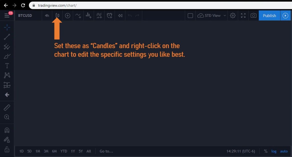
It should be mentioned too that on my chart “Candles” are used with countdowns to the bar closing under the price label, so to have them on your chart click on the box next to the Time Interval set to “4HR” instead of using another plain-looking line that can easily get confused with other indicators. These box-and-whisker candles are great because they allow you to see where majority of the volume is (box) as well as the highs and lows for each candle (whiskers on each side). I also am a big fan of the “Dark” color theme to help save my eyes and pixels while having the chart up for an extended period of time.

Bonus: Pro Tips
My Strategies & Indicators are tuned specifically as follows for the resulting chart seen above and they are set to have the Volume at 1 (easy to tell actual volume), Linear Regression at 3.078 for the upper deviation and -1.282 for the lower deviation and the maximum count of 2000 (allowing the regression to have 1 degree of freedom at the top and infinite degrees of freedom at the bottom), and the Bollinger Bands are set for 200 length and 2.95 standard deviations (about a 33 days long with a 99% confidence interval). I choose to smooth out my Lazy Bear stochastic indicator if it means anything to you and have it set for a Channel Length of 20, Average Length 42, Over Bought Level 1 of 120, Overbought Level of 2 106, Over Sold Level 1 of -120, and Over Sold Level 2 of -106 for my preferred layout view. Finally, in my latest chart I used the Fibonacci retracement tool under the pitchfork menu (on the left-hand side of the page when not in Fullscreen mode) to plot the line as close to the approximate bottom all the way up to the approximate top (or vis-versa for a bear market) to display the corresponding resistance points that are between the most recent trough and peak. Also, the longer time frames like 1 day and 1 week with these settings adjusted accordingly usually produce very nice and intriguing charts.
Let me know if you have any comments or suggestions.
Happy charting!
DISCLAIMER
This post is not intended to provide any investment, financial, legal, regulatory, accounting, tax or similar advice, and nothing should be construed as a recommendation to buy or sell nor a solicitation of any investment or to engage in any investment, strategy, or transaction. An investment in any strategy involves a high degree of risk and there is always the possibility of loss, including the loss of principal. Nothing in this post may be considered as an offer or solicitation to purchase or sell securities or other services.
